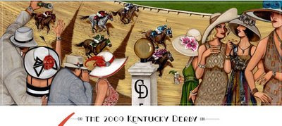
 And here's 2008 artwork, by artist Trish Biddle.
 I must tread lightly as I certainly ruffled a lot of feathers with last year's post, although I thought my opinions were quite reserved. Decide for yourself: Kentucky Derby Artwork.
I don't see much differentiation between the two pieces. Appearing as if painted by the same artist with similar palettes, there's so much...beige. Same art deco style, same fashion emphasis, same ladies hats representing the roses of the Derby and lilies of the Oaks, same wealthy-for-a day fantasy. The celebrated horse race plays a distant, insignificant role. If you peruse the individual artist's websites, you'll find lovely, whimsical, strong artwork. So, why is the Derby artwork so bland? And so alike?
Most annoying is the bored, disinterested depiction of the "fashionistas". Stereotypically turning their backs on the most exciting two minutes in sports.
OMG, is it over yet?
 As if our passion is exclusively a male bastion of cigars and bourbon. Maybe back in the art deco epoch.
 Even Britain's Her Royal Majesty the Queen will trample the poor blokes who dare stand between her and the races. Even my own dear mother would elbow those blocking the entrance to the winner's circle.
“Money, horse racing and women, three things the boys just can't figure out.” - Will Rogers

8 comments:
Your point is well taken. All I can think is that's exactly what they're looking for.
I have to agree with you, Sharon, on this one. Both artists' are very talented and one would have to wonder why the choice was made to seemingly copy the work from last year. I am of the opinion that each years artwork should be different from the previous year. That would open new markets for the licensing company. But then again maybe it's easy to do the same old same old rather than stick your neck out for something new and exciting. Not to say the 2008 and 2009 choices aren't exciting in there own way, they just look too much alike. To the two artists, congratulations and to the licensing company, give us Derby collectors something different. Stick your neck out.
Seems like Pomp is more the focus than Circumstance.
It's the horses, stupid. One would like to say. Not the hats.
And then, thankfully, there's your perspective.
I always enjoy your take on the flip side of art.
Nancy: I guess.
Anonymous: I didn't even consider those who collect Derby memorabilia year after year. You don't just absolutely love art deco? Sorry, seems like slim pickin's this year...
Bonnie: thanks for "getting" me.
Sharon, I agree with your point of view. The Derby has always been about the ATHLETES, not the spectators. Horses should be the focus...dynamic ones by an equine artist.
.................I loved meeting Carl Nafzger and Calvin Borel and presenting them with the originals I painted of Street Sense during Derby week. Not to mention Mr. Leroy Neiman and Mr. Bart Forbes 2005 Derby artist. One thing I have learned as an artist Ms. Scrute is to not be so scrutinizing of others success. You never know whose watching.
Moe: I whole-heartedly agree.
Anonymous: I never diss other artists. Another artist's success raises the bar for the rest of us, and I sincerely congratulate any accomplishments. I specifically stated that the KY Derby artist's artwork is "lovely, whimsical, strong artwork". I think you missed my point.
Believe me, I know who's watching. That's the entire idea.
the whole thing is crazy ! Come on ....thats basically a complete copy .
There a lot of people that go to the track that don't even look at a horse..whats that about ? (rhetorical question ...I guess)
Post a Comment